Bye Bye Aspirant Analytics, Hello Pirical - Our New Identity!
It’s time to open a new chapter.
Much has happened in the five years since Aspirant Analytics came into existence.
- We have grown from a team of 3 co-founders to a team of 25
- We have moved to Shoreditch and become a proper London tech start-up (with one big exception to the start-up identity: no external funding!)
- Many of our services have turned into industry-leading products, while others have faded away as we have learned about, and focused on, what our market needs
In January 2020, we decided to capture and crystallise this change with a new name and a refreshed visual identity.
Today, we are proud to share both:
We are Pirical. We're on a mission to drive better people data decisions. But we're not robots. We deliver powerful data insights with a human touch.
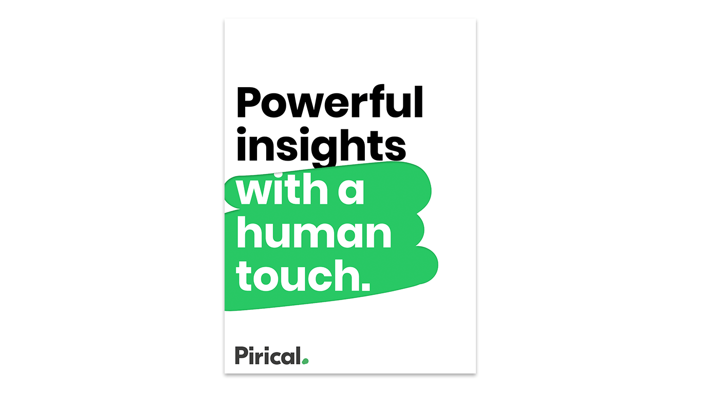
Here is the story of this transformation: what inspired and moved us, what we want to stand for, and what we want to let go.
Why Aspirant Analytics, anyway?
So for years we have been Aspirant Analytics. But what’s behind that name?
The honest answer: It was the least controversial option.
You may have heard stories of founders wrecking their brains in late-night sessions to find a good company name. Countless bad-to-mediocre ideas get bandied about, until one of the founders takes a lone walk in the forest and suddenly gets struck by a bolt of lightning inspiration.
It was similar for us, except that the lightning bolt never came (maybe because there are no forests in central London). So we settled on one of those ideas that are sort-of okay but didn’t really fill anyone with excitement.
That said, at the time, it was the right decision. An unexciting name hasn’t prevented us from growing rapidly, and not obsessing about it allowed us to focus on what matters most: adding value to our clients.
It’s time for a makeover
As we have hit an important revenue milestone and grown our team to 25, it seemed like the right opportunity to start a new chapter.
Most importantly, it needed to be a name and visual identity that our team would love, and that would accurately represent our company ethos and mission.
Why Pirical?
The name Pirical instantly connects to the concept of Empirical, which is at the core of our value proposition: to let the data speak, to base decisions on objective information, instead of defaulting to blind faith or groundless assumptions.
Also, because of this semantic connection, there is no doubt about how the word should be pronounced. After years of subtly correcting our clients and partners from [AS-p-rant] to [as-PIE-rant], we are looking forward to a new era of phonetic unambiguity!
Finally, the .com was available. Despite the proliferation of exotic top level domains (“.ninja” anyone?), we thought that the .com is going to come in handy.
Our brand idea
Our technology is proprietary, cutting edge and, in some cases, unique. But we’re more than a tech company. Our clients choose us because we give them business value, not more tools.
We use the latest innovations to help our clients decide where to focus attention, how to stand apart from the competition, and how to maximise their impact. All of these are delivered with a smile and a human touch.
In short, we aim to…

Powerful data insights with a human touch
Our new company tagline powerful data insights with a human touch reflects our ambition to help the HR and Recruiting community with People Data Analytics.
While we are data driven and empirical, we want to emphasise the human element in what we and our clients do. Dealing with people is a chaotic endeavour, in the best sense of the word - often inspiring, occasionally frustrating, sometimes unpredictable, never boring.
And while we have the ambition to tame the unpredictability of managing people with scientific accuracy and impartial analysis, our logo acknowledges that there will always be the need for human qualities — kindness, empathy and patience, to name just a few. Things that no algorithm can do.
(...this also means that, thankfully, the machines will never completely take over.)
The Pirical logo reflects this contrast between the scientific and the human: The black type in a sober font, the square dots on the i, the precision with which the c “plugs” into the a — all that stands for the analytical portion of what we do.
But next to this incarnation of accuracy and rigour is an imperfectly drawn green dot. A playful complement symbolising the human touch and the lively chaos of the human condition .
Bold colours
Our company colours have also changed. And quite dramatically so. Whereas Aspirant Analytics was dominated by a subdued colour palette…
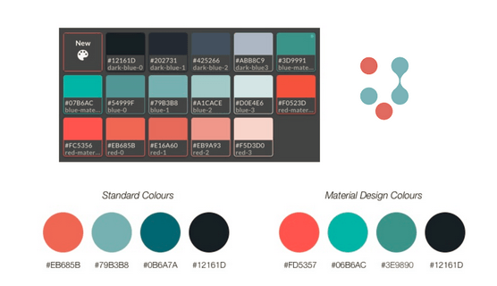
… our new colour scheme is simpler and bolder - white, black and green, symbolising the world, the scientific method and the human element. Green for Go Ahead with Confidence. It doesn’t get simpler than that.

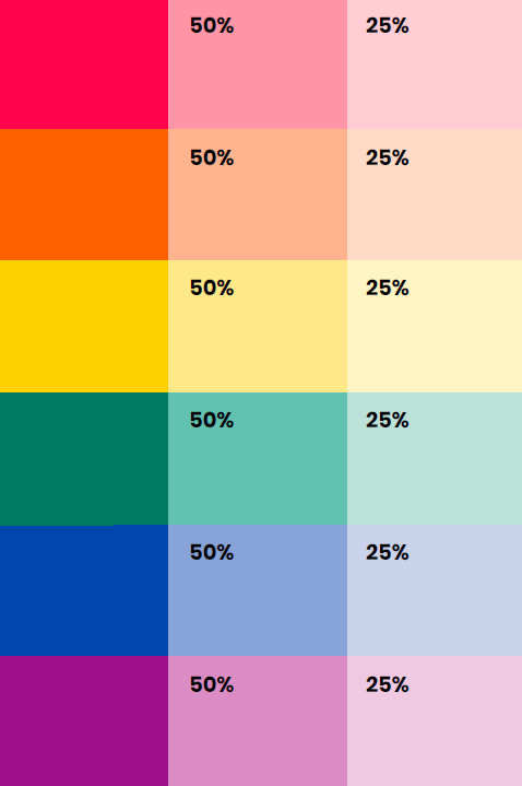
And while at Aspirant we tended to hew closely to our primary colours even in charts and graphics, at Pirical we will explore the full range of the rainbow with a warm secondary colour scheme that will help identify key bits of information and sign-post the way through insights.
Adding the touch
In line with our new tagline “Scientific With A Human Touch”, we’re introducing a recurring illustration element.
The Touch - A green swipe that adds playfulness to the brand and can be used in a multitude of contexts.

The Touch shows how human ingenuity uncovers what lies beneath the surface of everyday phenomena....

… and it perfectly encapsulates our approach of combining the scientific method with a human touch to find answers to complex problems.

New Imagery
And finally, we have formulated new guidelines for photography we want to adhere to.
Since we are a decidedly urban brand, we have decided to largely stop using nature photography. Nature is awesome, but we’ll keep it for the weekends. There’s work to be done.
Also, we’re an East London brand! While in the Aspirant Analytics days, we used photo models that mirrored our clients’ imagery — modern, but formal and somewhat corporate — we realised that our Shoreditch roots were nothing to hide.
We are proud of having grown and thrived near the Silicon Roundabout. So bring on the industrial chic, exposed brick walls, and people diversity.

But there’s an important nod to our clients: We’re choosing photography where the models are well-dressed and slightly more formal than the average East End co-working space.
After all, HR leaders in law firms and recruitment professionals will probably not be impressed with bare feet in the office, torn jeans and graffiti walls. As one of our clients who we interviewed for the rebranding told us: “Whatever you do, avoid the flip-flops and beanbag stereotypes.” Wise words, indeed.
Home-grown
Now, at this point you may wonder which agency did this for us. It’s a pretty comprehensive rebranding, after all.
But remember that we are a start-up and have never taken investor money. Bootstrapping is our first language here at Pirical.
And so it may not be THAT big a surprise for you to learn that ... it’s home-grown. No agency. Just some passionate people who love the mission of the company putting their heads together.
Our People Data Analyst Rob Griffiths (who has a real knack for visual brand identity) put together a tremendous briefing document, and handed it to a talented designer, Derek Man , who put the final identity together. We then worked closely with Elliot Parker to get the website looking ready to go.
We’re incredibly proud of the result.
What’s more, the enthusiasm with which the rest of the team have embraced the new name, brand and visual identity, tells us that we’re on the right track.
Sometimes, it is useful to keep things in-house.
* * *
We are beyond excited to share our new identity with you. Do you like it? I’d love to hear your feedback. Contact me at jenny@pirical.com
And if there’s a people problem we can help you with, we’re here to serve you — by applying data science with a human touch.
Subscribe to the latest data insights & blog updates
Fresh, original content for Law Firms and Legal Recruiters interested in data, diversity & inclusion, legal market insights, recruitment, and legal practice management.


